






Real Size Of Countries: The Definitive Guide to Physical Geography vs. Map Distortion
Welcome to Real Size Of Countries, the premier interactive educational platform created to eliminate centuries of cartographic illusion. By combining dynamic geodesic math with high-resolution satellite mapping, our tool reveals how large countries, continents, and territories truly are when freed from the spatial bias of 2D projections.
What Is the Real Size of Countries and Why Are Common Maps Deceptive?
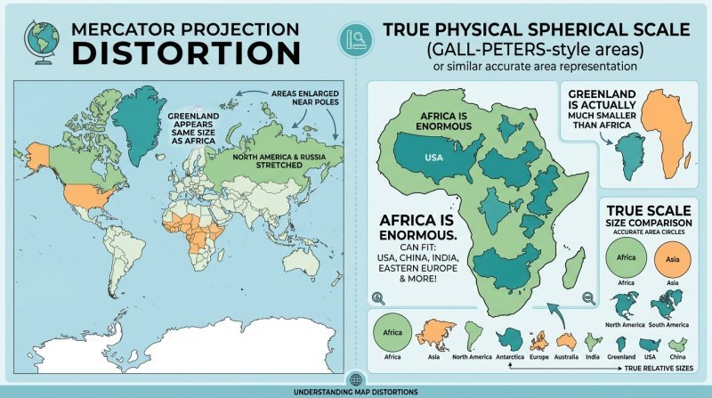
For over four centuries, classroom wall charts, digital navigation applications, and printed atlases have relied predominantly on the Mercator projection. While this 1569 map projection revolutionized maritime navigation by representing lines of constant compass bearing (rhumb lines) as straight vectors, it introduced an extraordinary visual compromise: it dramatically inflates the landmasses situated near the North and South Poles while severely shrinking equatorial territories.
Discovering the real size of countries is often an eye-opening revelation for students, educators, and travelers alike. When people ask, are the real size of countries exaggerated on standard maps, the mathematical answer is an unequivocal yes. To understand the real size of countries, one must first recognize that representing the curved 3D spherical Earth onto a flat 2D rectangular surface without geometric distortion is a mathematical impossibility—a fundamental truth proven by German mathematician Carl Friedrich Gauss in his famed 1828 Theorema Egregium.
Because paper and computer screens are flat, cartographers had to choose which geometric property to preserve: shape, angle, or area. Flemish cartographer Gerardus Mercator chose angles and shapes for sailors, causing surface areas to expand infinitely as one approaches the poles. As explored in our educational cartography mission, generations of learners grew up with deeply skewed perceptions of world geography.
The Mathematics of Mercator Distortion: The Secant Factor
The visual distortion that obscures the real size of countries is governed by a precise mathematical relationship. In the Web Mercator projection (EPSG:3857), linear horizontal and vertical distances are stretched by a secant factor proportional to the latitude $\phi$:
Zero area distortion. Equatorial countries such as Kenya, Indonesia, Brazil, and DR Congo reflect genuine physical scale.
Linear scale is doubled, making land areas appear 4 times larger than their genuine physical surface area.
Landmasses like Greenland and northern Siberia appear nearly 15 times larger than equivalent land at the equator.
Because area distortion expands with the square of the secant, northern continents appear monstrously large on typical world maps. This distortion is precisely why exploring the real sizes of countries with an accurate calculation engine is essential to unlearning these widespread geographic misconceptions.
Understanding the Real Sizes of Countries: Iconic Geographical Case Studies
Comparing the real sizes of countries side-by-side demonstrates the sheer scale of equatorial landmasses vs. polar exaggerations.
Africa vs. Greenland
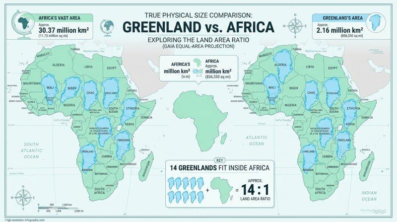
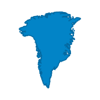
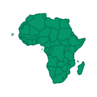
On standard Mercator maps, Greenland appears comparable in size to the entire continent of Africa. In reality, Africa encompasses 30,370,000 km², while Greenland measures only 2,166,086 km². Africa is actually nearly 14 times larger than Greenland! You can compare Greenland vs Africa on our interactive map to witness this scale shift firsthand. In fact, the United States, China, India, Japan, and all of Western and Eastern Europe can simultaneously fit within the borders of Africa with room to spare.
Africa vs. Russia
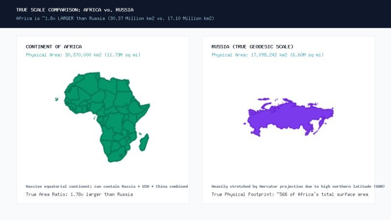
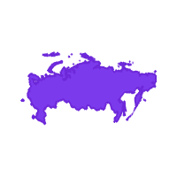
Russia is the largest country on Earth by political territory, spanning eleven time zones and measuring 17,098,242 km². On conventional world maps, Russia appears larger than all of Africa and North America combined. However, Africa’s true physical land area is roughly 1.8 times larger than Russia. When you drag Russia down to the equator on our map, its visual footprint shrinks dramatically to its authentic physical scale.
India vs. Europe
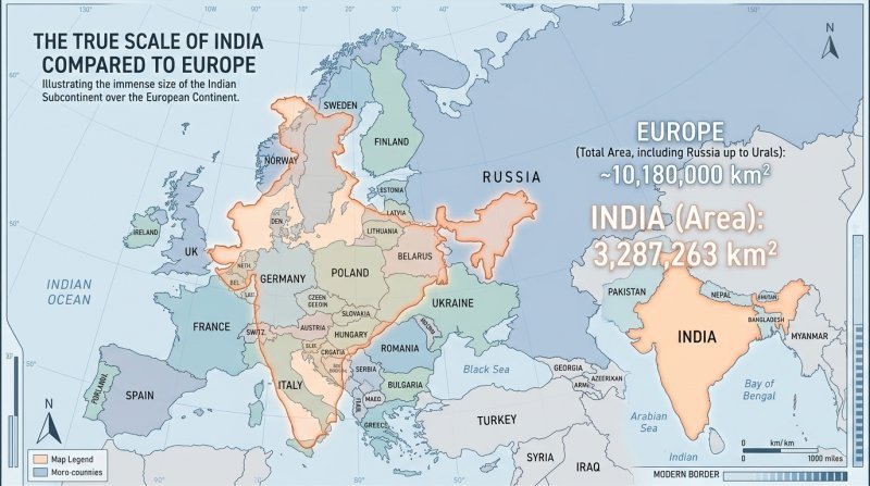
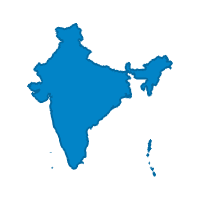
India (3,287,263 km²) often appears modest in size on classroom wall maps due to its equatorial proximity between 8°N and 37°N. Yet when you drag India onto the European continent, it stretches from London all the way to Baghdad or from Norway to the Mediterranean Sea. Evaluating the real sizes of countries demonstrates how dense subcontinental landmasses like the Indian subcontinent are routinely underestimated.
Brazil vs. Australia & Contiguous USA
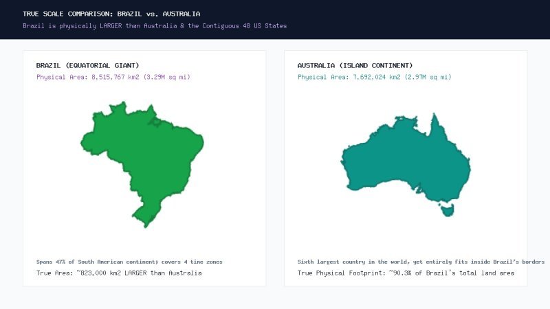
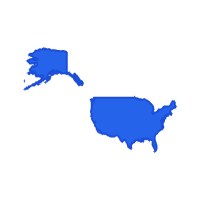
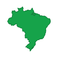
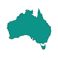
Occupying nearly half of South America, Brazil (8,515,767 km²) is substantially larger than Australia (7,692,024 km²) and physically larger than the 48 contiguous United States (~8,080,464 km²). Because Brazil straddles the equator, flat maps severely compress its visual boundaries, masking its enormous continental proportions as confirmed by official sovereign land area data.
How Our Real Size of Countries Map Solves Projection Bias
To eliminate the visual distortions of conventional cartography, we engineered an interactive real size of countries map powered by spherical trigonometry and real-time geodesic calculations. Rather than treating national boundaries as rigid 2D pixel shapes, our software treats every country as an invariant physical geometry projected on the surface of a three-dimensional sphere.
Here is how the transformation works behind the scenes on our real size of countries map:
- Spherical Geodesic Invariant Modeling: When you select any country, territory, or US state, our system computes the true Great Circle distance ($d_i$) and bearing angle ($\theta_i$) of every polygon boundary vertex relative to the nation's geographic centroid ($C_0$).
- Dynamic Latitudinal Re-projection: As you drag the country to any new coordinate ($C_1$), the coordinates of all boundary points are dynamically recalculated via spherical trigonometry: $P_{\text{new}, i} = \text{turf.destination}(C_1, d_i, \theta_i + \alpha)$.
- Real-Time Mercator Counteraction: When a northern country is moved toward the Equator, the Web Mercator projection naturally contracts the polygon coordinates, faithfully displaying how small it is in physical reality. Conversely, when an equatorial country is dragged toward the Arctic, it expands to show how gigantic it would appear under high-latitude distortion.
- Full 360° Geodesic Rotation: By rotating the boundary polygon, users can seamlessly fit one country directly inside or alongside another to compare coastlines, mountain ranges, and regional borders with exact precision.
By interacting with our dynamic real size of countries map, learners, researchers, and cartography enthusiasts can witness authentic global proportions in a tactile, unforgettable format.
How to See the Real Size of Countries: Step-by-Step Interactive Guide
If you are wondering how to see the real size of countries using our web application, the process is straightforward and requires no specialized software or GIS downloads. Follow these easy steps to map real size of countries directly in your browser:
Search & Select
Type any nation, dependency, or US state into the search bar in the left control panel. Click the autocomplete result to instantly render its boundary onto the map canvas.
Click & Drag
Grab the highlighted country outline and drag it anywhere across continents or oceans. Watch in real time as the polygon resizes to reflect its true physical scale.
Rotate & Overlay
Use the circular rotation handle or the 360-degree rotation slider to orient the territory against target coastlines, borders, or neighboring regions.
Direct Comparison
Switch to the Direct comparison tab to pick two countries simultaneously (e.g., India vs. USA or Greenland vs. Africa) and instantly overlay one atop the other for automated comparison.
With our intuitive interface, discovering how to see real size of countries takes just seconds. Whether you are conducting academic research, exploring our about page, or consulting our real size FAQ, our map real size of countries engine delivers instant, mathematically validated answers.
Why You Need an Interactive Map Real Size of Countries Tool
For centuries, traditional atlases have shaped human geopolitical perspectives, unconsciously elevating higher-latitude countries while diminishing tropical and southern regions. Our mission at Real Size Of Countries is to restore cartographic truth and spatial equity through interactive data visualization.
By utilizing an interactive map real size of countries, educators can engage students with interactive geometry lessons, journalists can fact-check geographical claims, and curious explorers can uncover the true vastness of our planet. Learn more about our mission on the About Us page. Experience the real size of countries today and see the world as it actually exists.